Pairs
So, you want to become more confident or well-informed when choosing hues for your jewelry and other creations? This post assumes that you are already familiar with the basic color wheel.
Value
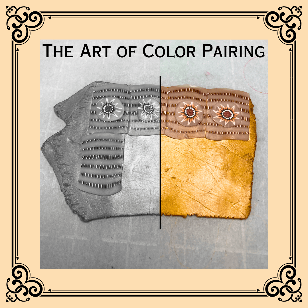
What's value? Value is relative lightness or darkness. In the photo on the right, the bright orange of the right saucer is distinctly different from the plum of the cup exterior and the citron of the inside. You can clearly see the blue, gray, and yellow of the left cup and saucer (unless you are color blind, of course).
Contrast that with the right photo, where specific hue has been removed and only Value remains. The right teacup looks the same darkness as the countertop, and its saucer and interior appear about the same shade as the left saucer, cup, and cup interior. Value has a big impact on the emotions conveyed by a pair of shades.
Which photo is more appealing to you? Can you think of a situation where the other photo might be more useful? I like the saturated photo better. If I were writing a story about two friends meeting in a melancholy coffee shop to talk about their lost love? - the black and white photo would better convey the mood.
Developing a Palette
The first step in making a palette is defining your base shades, the two hues that anchor define the essence of your palette. Once you’ve decided on your base pairs, you can add additional shade. In this post, we’re focusing on developing your hue pairs.
When I’m starting work on a new palette, I think first of the mood or feeling I want the palette to evoke. Maybe it’s something as vague as “Moonlit Garden at Midnight” or “Mosh Pit” or even “Lazy Summer Afternoons”.
Or perhaps the scene is more specific, like “Aunt Maude’s Victorian Kitchen”, or hues from a particular painting.
Close your eyes, and imagine your scene as vividly as you can. See what hues come into your mind. Then open a shade picker grid like this one: https://htmlcolorcodes.com/color-picker/
You can move the small circle around with your mouse, and you’ll see the resulting hue in the box at the top right. Use the tall narrow slider bar in the middle to change the base hue of the big square. When you find a hue you like, note the hex code number from the top line. There is also information for RGB (Red-Green-Blue) and HSL (Hue-Saturation-Lightness) if you prefer.
In an online platform like canva.com, drop your hue pairs and save them for future reference. This works even with the free version of Canva.
Monochrome Pairs
Here are some classifications of hue pairs that can guide you as you choose your two starting shades!
Monochromatic pairs contain two variations of the same hue. Here we have a deeper gray-ed green with a lighter version of the same green hue. That is, the left square has a deeper value, and the right square has a lighter value.
Monochromatic schemes generally have a relaxed and coordinated feeling. A black and white pair is also considered monochromatic even though it technically is devoid of any specific hues.
Bichromatic
A bichromatic palette has two hues. Below you see red and green.
A blue and a green, or an orange and a purple are other examples of a bichromatic hue pair. This green and red are opposite on the color wheel, so have a feeling of tension, high energy. In addition, these hues are nearly the same value (darkness), making it feel like both are demanding attention at once. Pairing a hue with its opposite on the color wheel and making both similar values is not usually a peaceful pair.
A bichromatic hue pair is made of hues near each other on the color wheel, like this blue-green and a yellow-green) still have energy, but the feeling of tension is usually much less. Additionally, the yellow-green has a lighter value than the blue-green. How does this energy feel to you?
Contrast
When you vary the value of the hue in a pair, it feels totally different. Here there is the almost pastel mint green (a very light value) and a dark red (very dark value. It could also be a dark green with a pale red, or even white with black.
How does this pairing make you feel? With these hues in such equal amounts, the pair may feel a bit unbalanced to you, as though the darker red half feels heavier than the lighter green? What about in the two samples below, where the amount of each hue is varied? Pay attention to how each pairing makes you feel, what emotions it evokes in you.
To me, the upper image (more red than green) feels kinda like I’m out in the dark, peering through a mail slot into a lighted hallway. The lower image (more green than red) feels much more expansive, like a shelf on a pale green wall. Take time to identify how you feel! (And yes, both interior lines are exactly the same size!!)
When both hues are near the same light value, like this mint green and medium pink, the pairing can feel blah, boring.
Intensity (Saturation)
On the other hand, when both hues are the same dark value, like this bright red and bright purple, the impression is vibrant and active. Does it feel that way to you?
When the same purple and red are partially desaturated, they become a lot more quiet and clamor less for your attention.
Energy
The yellow and orange you see here are saturated, nearly the same value, adjacent on the color wheel. In these warm shades, the pairing usually feels energetic and optimistic.
This pairing of a muted green and a muted blue, both nearly the same value and adjacent on the color wheel, have much less energy. Do they strike you as restful, relaxing- or what?
Neutral Pairs
And finally, neutral color schemes. You can construct a pair with either warm or cool values. This warm-leaning taupe and biscuit are monochromatic, similarly hues with a darker value (taupe) and lighter value (biscuit). This pairing is relaxing, non-challenging, great for a background that doesn’t call attention to itself.
In contrast, this neutral pairing of a blued gray with a silvery pale gray feels cool, soothing, but also a bit sterile. Another good pairing for a background, depending on the emotions you want to convey.
Challenge
As part of your discovery journey, I challenge you to make your own huw pair corresponding to each of the examples above. Jot down what emotions they seem to convey. Then put them away for a week or a month.
When you take them out again, look at them one by one - without looking at your previous notes. Again, write down the emotions you feel looking at them. Finally, take out and compare your two interpretations. When the two notes about each color pair are pretty similar, they will probably communicate clearly for you. If, however, your color notes are quite different, you’ll want to further explore this pair and similar pairs to lock down what they actually mean to you.
I hope this brief overview of how colors relate to each other opens some new ideas and imagination spaces for you!!
